Homebound
Overview
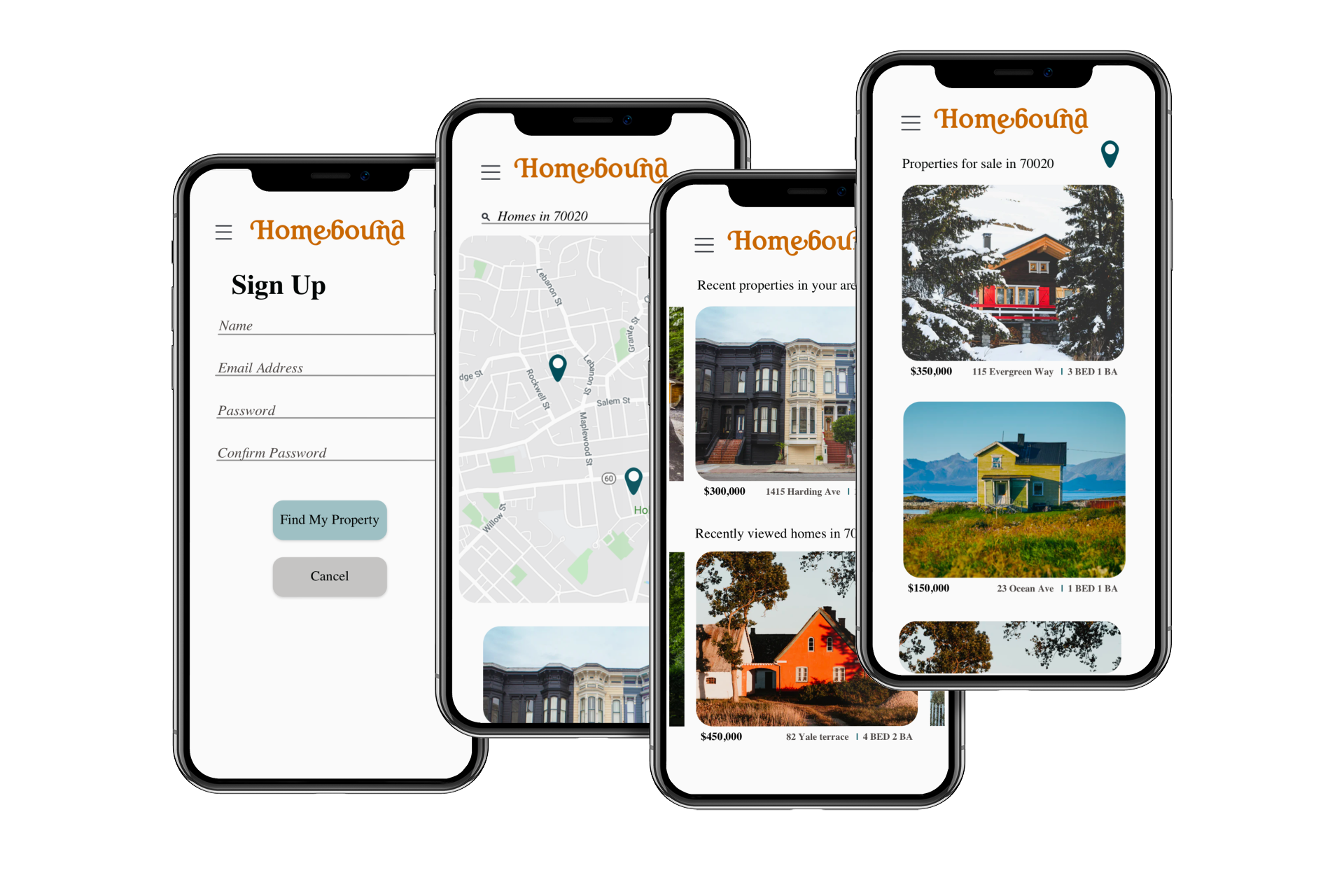
Homebound is an app that connects users to investment properties. What sets my app apart from other apps on the market, is the overall retro app aesthetic, strategic whimsical photography, and its focus on older or historic properties in need of updating or restoring.
Challenge
The challenge for this app was to build something that was modern and minimalist, while also appealing to the nostalgic and whimsical nature of the properties featured. I didn’t wan’t the app to feel outdated or old, but also didn’t want it to feel cold and impersonal.
Timeline
2 months
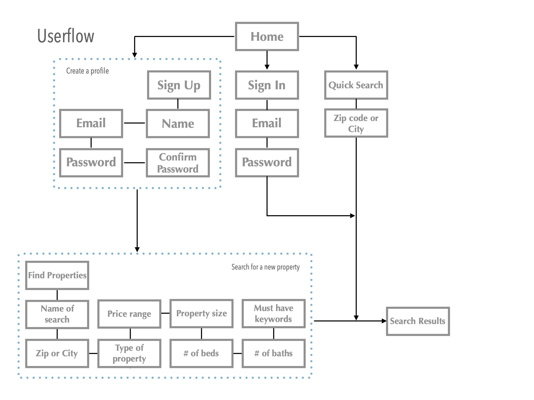
| Research and User Flows
Process
With so many big name real estate apps on the market, I wanted to find a way to break into the field with an app that had a different aesthetic. I did a competitive analysis of a few websites, and compiled a list of the features I would absolutely need to have available to my users. I also noticed that most apps have cluttered designs, with almost too many options, and I wanted this app to feel more “bare bones” in comparison.
Low Fidelity Prototypes
Low fidelity prototypes were created using Balsamiq to get an idea of what other features would be necessary structurally.
Mid Fidelity Prototypes
While tweaking the mid-fidelity prototypes, I discovered the need for a “map” feature so that users could look at properties in their desired locations, and added it to the app.
| Mood Boards
I created two mood boards to set the tone of the app. Celeste uses a cool, crisp color palette, modern minimalist fonts and icons. The color palette is bold, and somewhat masculine. Bright photos highlight the property space. On the other hand, Homebound Uses a touch of retro inspiration through the use of a 70’s inspired color scheme, and a retro font for its logo. Icons are minimal. Photos are clean, and focus is on charming features of a property.
I decided to use “Homebound” as it aligns more closely with the feel and purpose of the app. It was also during this stage that I renamed the app from “Perfect Properties” to “Homebound”, since the name was a better fit.


