Adulting
Adulting is a conceptual project that aims to connect people to a database of experts at any time through chat, call, or video messaging. Our database would offer all different categories, from home improvement to therapy.
The Challenge
Users need a trustworthy app that is simple, easy to use, and immediately connects them with a professional they can trust. They don’t want to wait in lines or waste time looking for answers. Younger users are more likely to try and find solutions to their problems online, than in person. Adulting bridges that gap.
The Solution
For either a fixed rate, or membership option, Adulting would connect its users safely and promptly, with experts that can answer their questions via the communication method of their choosing. The app would replace extensive Google searches, fruitless phone calls to family or friends, and would provide safe and reliable answers to their problems.
process
Competitive Analysis
There were very few apps similar to Adulting. I did some research into the apps “Answered.” which helps answer questions that new parents might have about their babies, and “Quora”, which allows users to ask and answer questions. Angie’s List was considered, but it’s more of a directory than a platform for people to engage with professionals.
User Interviews
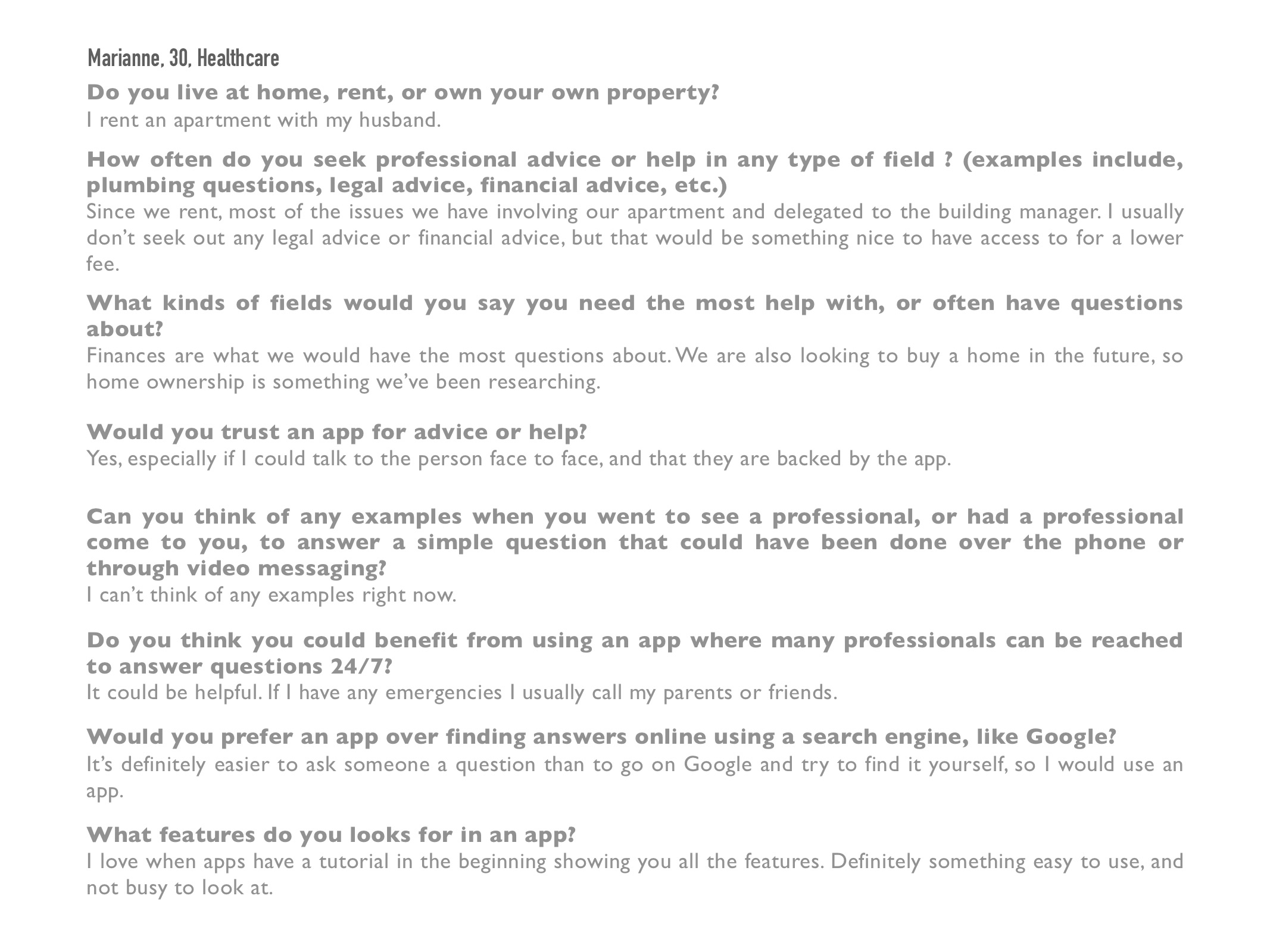
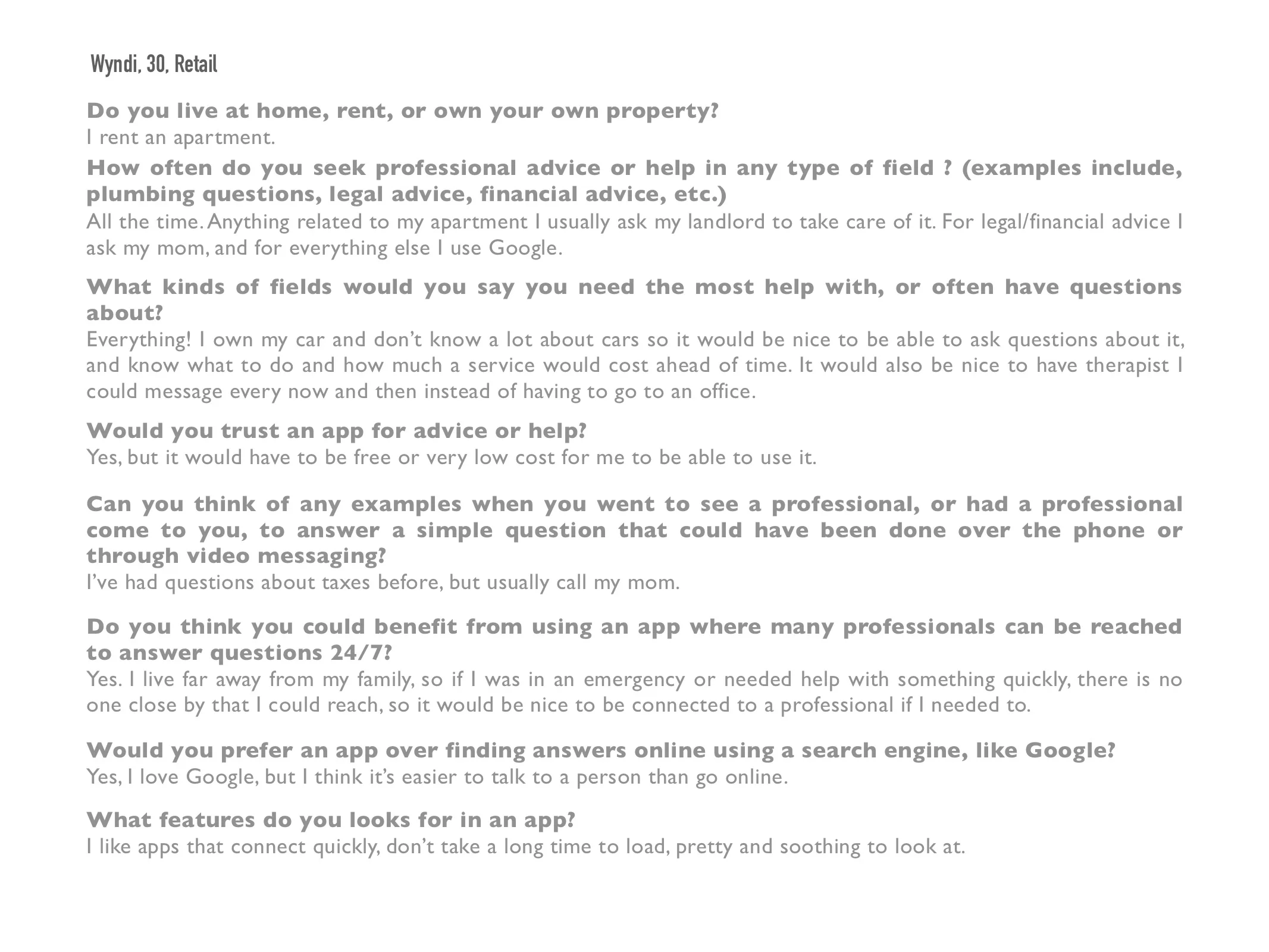
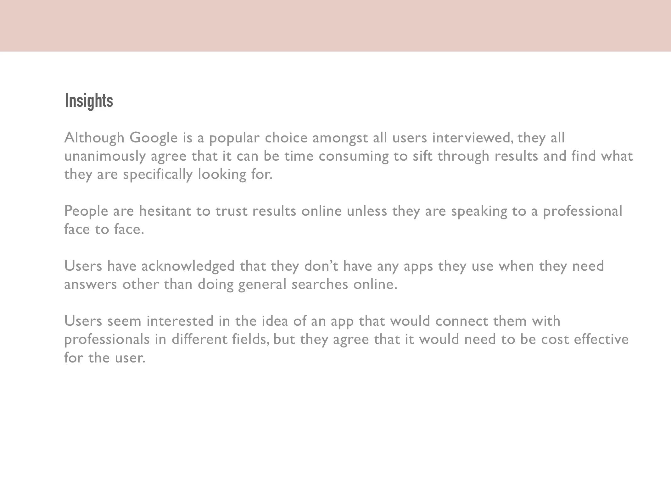
Through user interviews, I was able to narrow down on which features would be most beneficial to our users. I wanted to engage with younger users, as they are more likely to use search engines to find answers to solutions, without going to a “source” first.
User Research
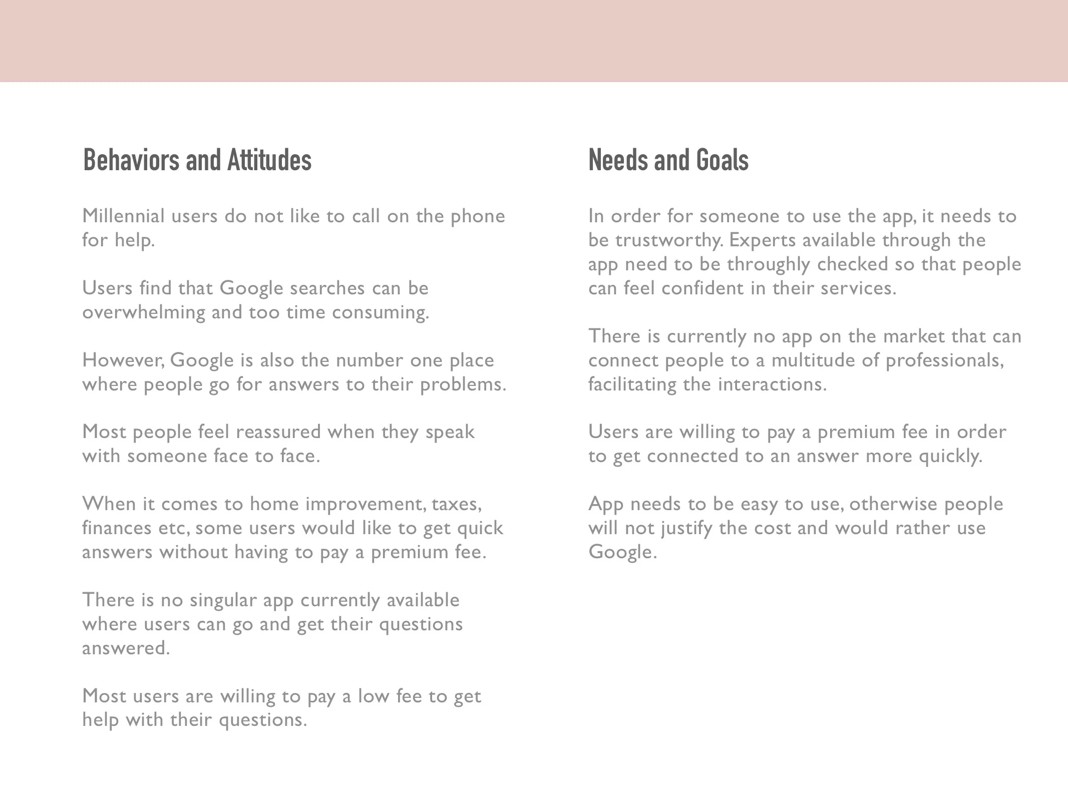
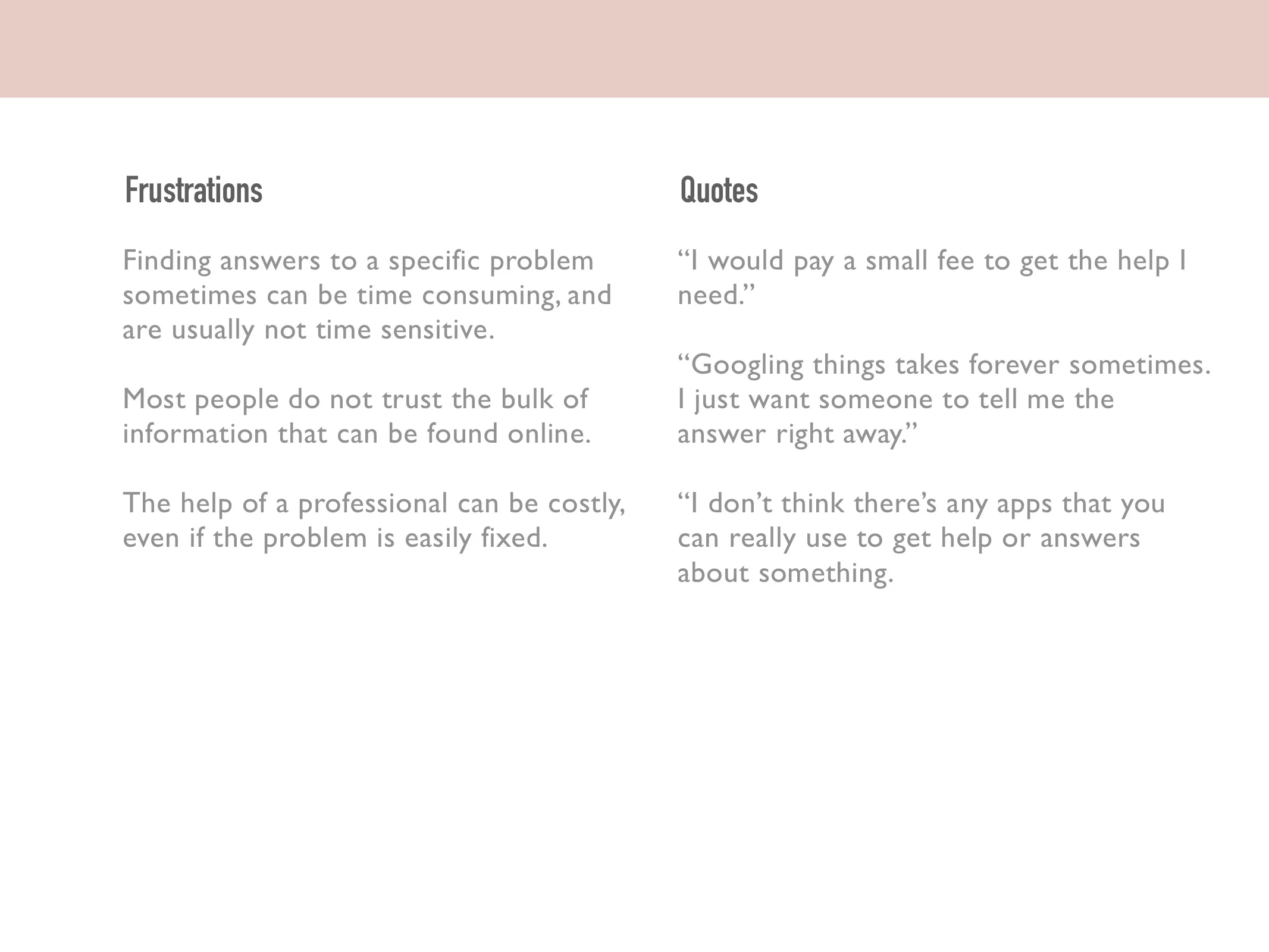
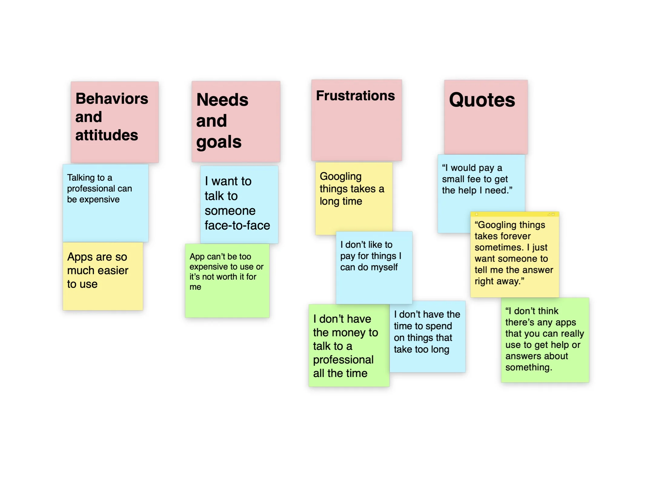
The user interviews allowed me to gather insights and perform a card sort, in order to organize the data I compiled.
User Personas
Millennials are our target user. After reaching out to volunteers and conducting live interviews, we were able to create a few user personas that symbolize who our target audience was: Young, professional individuals who would be willing to pay for an app that can save them time, and connect them to a professional using their chosen method of communication.
User journeys
Once the user personas came to life, I could really get into their heads and figure out what their journeys might look like. I found user journeys to be extremely important in identifying what APP features needed to be modified so that the user could get to their task immediately. I wanted the user to be able to have access to all of the app’s features no matter where they were located in the app. I chose to go with a visible toolbar on the bottom of the screen for ease of navigation.
Information Architecture
Content Auditing
In order to establish a framework for the app, I performed a limited content audit on the Angie’s List website. Angie’s List needs a total revamp of its website. It is easy to use, fonts are big and information is clear, but the site’s layout is redundant, repetitive and at times very confusing. Color schemes are completely different depending on which page you are on.
On the home page alone, there are multiple different links to the same content. The information should only be displayed one time to minimize confusion. Videos/Photos are not organized at all, and randomly displayed. The user can’t search based on date or even topic, and must scroll through all the content to find what they are looking for. There is way too much content, and it is not clearly organized.
Low Fidelity
Mid Fidelity
Usability Testing
Using the mid-fidelity prototypes, I conducted some usability tests to gage if any other features were necessary. Participants pointed out that they needed certain features such as a “filter” for search results,
A link to the usability tests and test results can be found here and here.
Final Design
The high fidelity prototype can be accessed below. The first version relied on a prominent pink background color that was modified to white, for greater accessibility.


